Sunday, September 26, 2010

8 | Marketing | Package to give to panel

Here is what I plan to present, in a white A4 Gloss presentation folder with a 'TN Photography' sticker on it:

1. Business Card x2
2. Sample CD
3. With Compliments Card
4. A4 Promo
5. Envelope
6. Website - Screen grab - printed on A4
7. Blog - Screen grab - printed on A4
8. Letterhead
9. Facebook business page - Screen grab - printed on A4
10. Example Quote
11. Example Contract

[Logo will be on letterhead, card etc]

See 8 | Marketing | TN Photography to see my marketing tools

Friday, September 24, 2010

6 | Tn Photography | Affiliates

Web Desginers

Designers & Suppliers

Makeup Artists
Maria Spatolisano

Graphic Designers

Hair Stylists
Zach Klingher

Printers
CIT Printing Services - for professional prints, exhibition prints

5 | Working Process | Planning

I plan almost every aspect of my shoots, from models and lighting down to the nail-polish colour. Here is what I use to help me plan and organise shoots:

[scan in planning]

5 | Working Process | Lighting: Movement & Flash

I proposed at the beginning of this semester that I wanted to experiment with 'movement' in my photographs, both in-camera and in post production.

Below is a test shoot in which I achieved camera movement in-camera with flash, in the studio. Analysing images that already exist and with the help of Julian and discussion in class, and my own experimentation I was able to achieve this, and I realised it's nothing to be scared of! It's actually not hard at all, just needed to have a go at it!

Thank you to my mum who happily waved her arms like a chicken for 20 minutes hahaha. Of course with my actual shoots I will get the model to pose properly.

Test Shoot

1. Flash & Slow Shutter
ISO 50


2. NO Flash & Slow Shutter
ISO 500

Head still, arms moving:


Whole body moving:


3. Making the Cyc Zone 2-3

Finally with some flagging I made the cyc the dark zone that I wanted! Model was far away from background, main light was far away from cyc, flag was used so that there was no spill on the background allowing a dark zone.

5 | Working Process | Lighting : Boxing


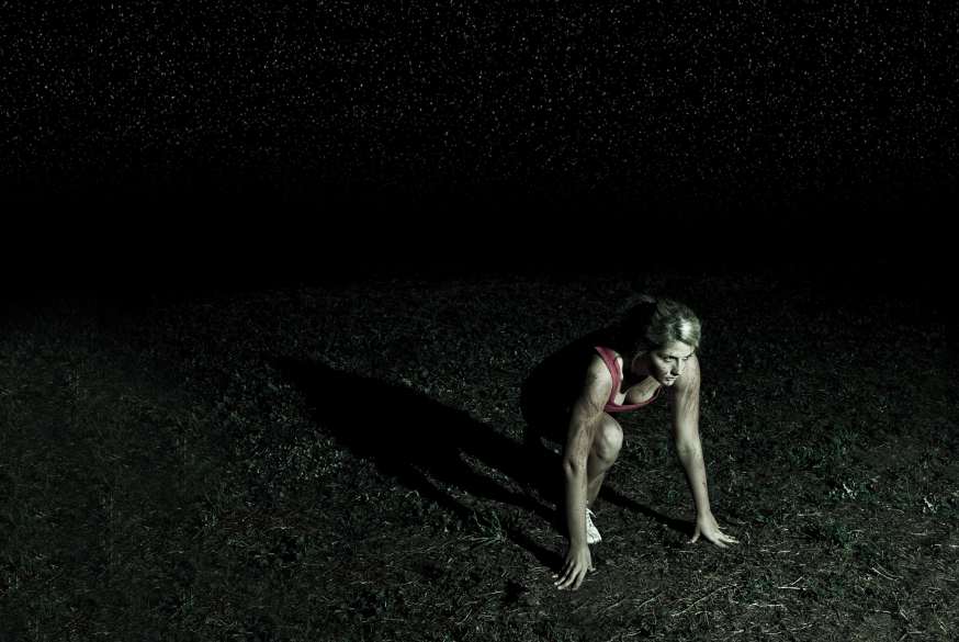
This shoot was extremely challenging. I aimed to capture a shot in which the model was moving, capture sharp water droplets and a good expression and pose. To capture all of these elements all in one shot was almost impossible. I ended up shooting one great image of the water droplets, and then just focusing on the model flicking her hair with a good expression and pose. And my final image will be a composite of these two combined.

Technical Aspects & Production

1. The power packs had to be on the lowest output possible, i.e. 3.0, to ensure a sharp capture of the water droplets. The more lights in, the faster the shutter duration, therefore the sharper the droplets.
2. Sheets on floor and over power boxes to ensure no water reaches electricity
3. The model's hair needed to be drenched with water to ensure enough water droplets
4. The snoots in the background helped light and define the droplets
5. A shutter of 125th was used to ensure that a) everything is sharp b) no tungsten/room light affects the shot
6. A fairly wide aperture needs to be used to make sure there is enough depth of field to capture the model and water droplets. The background is not important and did not have to be in focus. Therefore f/6.7 was sufficient.

Test Shoot

Below is a close up of the water droplets. They could be sharper, but I decided I like this amount of sharpness because it still contributes to the 'movement' of the image. Also, the droplets just add an extra element to the image - they are not the sole focal point of the image - therefore this was enough.


Below is a photograph of my test setup and includes all the values that were used to achieve the above image.


Final Image

Minimal editing in Lightroom, water droplets need to be added, image may be cropped for a slightly different composition. Not perfect yet, and there are still more images to go through to make sure this is 'the one'.


Photograph: Tina Nikolovski

5 | Working Process | Lighting: Shadows

In this test shoot I experimented with light and shadows. I didn't have a model to test the light on so I used a mannequin from the fashion department. I am using these lighting techniques as a part of my 'mixed advertising' folio.

I learnt a lot about the principals of light. See lighting notes below.

Test Shoot


Principals of Light

5 | Working Process | Lighting : Harsh, dark, male


One of my main goals this semester was to be as confident as I can be with lighting. I have been viewing many images and analysing how they have been lit and the technical elements of that image. I have also been experimenting with my own techniques.

See below:

Inspiration:


One Shoot, 6 Setups:

Below are the images taken within 40 minutes of my dad. One shoot, 6 setups, mainly moving changing one or more lights each time. Here I wanted to experiment with backlighting, flare, silhouettes, shadows and a moody dark feel suitable for males.


1


2. Too much fill


Just enough fill


3. Silhouette - more dramatic feel


4. One light, limited detail, use of negative space


5. Flare in camera - half cropped out by composition


6. Full flare - lights straight at camera


7
Shadows


Thursday, September 23, 2010

7 | Final Exhibition | Website & Invitation


Hi All!

So we finally decided on the name (yay!). The website has been started, but needs to be updated with photographs and information, so don't give out the URL just yet this is just for us.

I'm not sure who was meant to design the exhibition invitation, but 5 minutes after I put a 'casting' out for a graphic designer to help us out to design it I got an idea! See below - very minimilistic but I think it looks modern and really goes well with the name. Simple. And it's black and white so it will be cheaper to print!

Let me know what you think!

Name: White Walls

Website URL: www.whitewalls.carbonmade.com

Invitation Proposal:


[Ps. Text on invite below needs to be checked/updated]

Tuesday, September 21, 2010

11 | Exhibition | Name Ideas

'Signature'

'White Wall'

'White Walls'

Teri, Nathan, Georgia and I like White Wall. Nathan suggested White Walls and I actually think I like that better now:)

Suggestions?

Thursday, September 16, 2010

6 | TN Photography | Artificial Elements


FOG

Before:

Photo: Tina Nikolovski

After:

Photo: Tina Nikolovski

Layers:

Process:

I followed the exact process show on this website:


http://www.biorust.com/tutorials/detail/229/en/


STARS


Before:

Photo: Tina Nikolovski

After:


Photo: Tina Nikolovski

Layers:


Process:

I followed the exact process show on this website:


http://www.absolutecross.com/tutorials/photoshop/textures/starscape/

6 | TN Photography | Little Sparrow Website

See post: http://nikolovskistage6.blogspot.com/2010/09/6-tn-photography-graphic-design-issues.html

Issue has been sorted! Original images shot by TN Photography have now been replaced.

Check out the brand new Little Sparrow website! Selected images by TN Photography


Tuesday, September 14, 2010

11 | Exhibition | Name Ideas

Following on H20 (we all have water in our folios), I thought of :

'Element'

I love this name! Water is an element. Makes it a bit more ambiguous than h2o. Plus it can have so many other meanings! Sounds modern too. What do you all think?

Other ideas:

Salt

Signature

Pepper

6 | TN Photography | Graphic Design Issues

In today's digital world it has never been more important to monitor your photographs. Below are the photographs I took for designer Little Sparrow. The website that was made by Little Sparrow's graphic designer showcased my images but my photographs were heavily saturated, contrasted and the colour balance was not right. I sent an email to the graphic designer today in relation to this issue and a polite request to reload the images again with the correct colours and contrast/saturation. Will keep you updated on the response.

The images to the right are my images, the images on the left are the images that are featured on the website. You can see the difference is significant and the model's skin suffers with the dramatic editing that was not done on my behalf.

I am also listed as a credit on this website so I do not want work shown that is not purely mine because I would never edit my images this heavily. Just thought I would share this experience as I am only in the first few months of launching my business and I have already experienced a number of similar encounters in relation to copyright and moral rights.


5 | Working Process | Location

I am trying really hard to get permission to photograph in an area in Melbourne! I am so keen to photograph here! Will show images in class. Fingers crossed, I think I may have to be very persistent with this one!

Monday, September 6, 2010

5 | Working Process | Development of Initial Proposal

Initially my portfolio was to be broken up in the following sections;

1. Elements of Design - Series on Shadows (6 images max)
2. Various fashion and advertising images (6 images max)
3. Bizarre Series (6 images max)

It will now be 2 series and the 'shadow' shots will be integrated in 'various fashion and advertising images'

Updated Proposal

1. Various Fashion & Advertising Images (12 images max)
These images are produced individually and are not part of a series
2. Bizarre Series (12 images max)
These photographs are part of a fashion spread that are tied together by one common element - something in each photograph is out of the norm.